Most Swing applications get their look from a Look and Feel (L&F)either a standard one provided by the VM or a custom one. L&Fs are a whole lot of work to build and still aren't completely custom. You can redefine a button to look like red stoplights, but then all buttons throughout your application will look like red stoplights. Sometimes all you really want is a look built entirely out of images, much like image-based web navigation.
To give you an idea of where this hack is going, Figure 1-1 shows our target: a frame with a panel containing a label, a button, and a checkbox. The panel, label, and button will be completely drawn with images, using none of the standard L&F. The checkbox will be a standard checkbox, but it should be transparent to fit in with the image background.
The first step toward image nirvana is the background. Because this type of component is quite reusable, I built a subclass of JPanel called ImagePanel, shown in A Custom subclass of JPanel
public class ImagePanel extends JPanel {
private Image img;
public ImagePanel(Image img) {
this.img = img;
Dimension size = new Dimension(img.getWidth(null),
img.getHeight(null));
setSize(size);
setPreferredSize(size);
setMinimumSize(size);
setMaximumSize(size);
setLayout(null);
}
}
The constructor takes the image to draw and saves it for later use in the img variable. Then it calls setSize( ) and setPreferredSize() with the size of the image. This ensures that the panel will be the size of the image exactly. I had to set the preferred, maximum, and minimum sizes as wellthis is because the panel's parent and children may not be using absolute layouts.
Absolute layout means that there is no layout manager to position the components appropriately (which can be set by calling setLayout(null)).
In this case, the explicit size and position will be used (via setSize( ) and setLocation( )). When a layout manager is set, the preferred, minimum, and maximum sizes may be used. To cover all of the bases, simply set all four values to the image size.
Now that the panel is sized appropriately, you can paint the image by overriding paintComponent():
public void paintComponent(Graphics g) {
g.drawImage(img,0,0,null);
}
It's important to override paintComponent( ) instead of paint( ), or else the child components won't get drawn.
To test it, uses an ImagePanel and the usual JFrame.
Testing out image-based panels
public class ImageTest {
public static void main(String[] args) {
ImagePanel panel = new ImagePanel(new
ImageIcon("images/background.png").getImage());
JFrame frame = new JFrame("Hack #1: Create Image-Themed Components");
frame.getContentPane().add(panel);
frame.pack();
frame.setVisible(true);
}
}
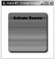
When run, the ImageTest program looks like Figure 1-2.
Now that the background is done, it's time to focus on the label, Activate Reactor. This is just a static image that sits at a certain position on the background. You could use another ImagePanel, but since the Activate Reactor text is logically a JLabel, you can just create an ImageLabel subclass, as shown in
An image-based label
public class ImageLabel extends JLabel {
public ImageLabel(ImageIcon icon) {
setSize(icon.getImage().getWidth(null),
icon.getImage().getHeight(null));
setIcon(icon);
setIconTextGap(0);
setBorder(null);
setText(null);
setOpaque(false);
}
}
As with the ImagePanel, set the size of the label to match the size of the image. The rest of the sizing isn't needed because the JLabel will take care of that itself. Next, set the icon to your image, which lets the JLabel take care of the image drawing. Setting the icon text gap to zero and the border and text to null will remove any extra space around my image, resulting in a perfect mesh with the background. The final setOpaque(false) tells the label not to draw its own background. If your image fills the label then this won't matter, but if the image has transparent areas (as PNG files often do), then this will let the background shine through the transparent parts.
Add this code to ImageTest's main() method:
ImageLabel label = new ImageLabel(new ImageIcon("images/reactor.png"));
label.setLocation(29,37);
panel.add(label);
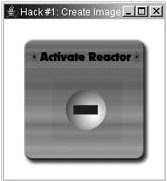
The result is shown in Figure

A custom JLabel
Next comes the button. Because buttons have rollovers and states, they are a bit trickier. Again, start with a JButton subclass, as in

Creating an image-based button
public class ImageButton extends JButton {
public ImageButton(ImageIcon icon) {
setSize(icon.getImage().getWidth(null),
icon.getImage().getHeight(null));
setIcon(icon);
setMargin(new Insets(0,0,0,0));
setIconTextGap(0);
setBorderPainted(false);
setBorder(null);
setText(null);
}
}
The code is almost the same as JLabel. The only difference is the addition of the setMargin() and setBorder() calls. Most Look and Feels use a border and margin to indicate when the button has been selected. Labels aren't selectable so they don't have those methods. In any case, these are two more properties you can simply turn off.
Add this code to ImageTest's main() method:
final ImageButton button = new ImageButton("images/button.png");
button.setLocation(60,74);
panel.add(button);
The result is shown in Figure 1-4.
Image button
Now that the button is visible, you only have to add the rollovers and other states. Fortunately, this doesn't require any new coding in the subclassJButton already provides support for images representing the rollover, pressed, selected, disabled, and disabled selected states. You can add various states by using normal set methods:
button.setPressedIcon(new ImageIcon("images/button-down.png"));
button.setRolloverIcon(new ImageIcon("images/button-over.png"));
button.setSelectedIcon(new ImageIcon("images/button-sel.png"));
button.setRolloverSelectedIcon(new ImageIcon("images/button-sel-over.png"));
button.setDisabledIcon(new ImageIcon("images/button-disabled.png"));
button.setDisabledSelectedIcon(
new ImageIcon("images/button-disabled-selected.png"));
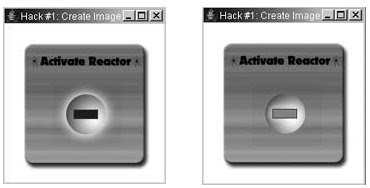
the images I used to represent each state. The rollover effect is done with an outer glow, and I used a blur for the disabled state. The red rectangle in the middle represents the selected state, and it includes its own color change and red glow mimicking a real glowing lightbulb.

Unselected button with rollover & Selected button
On Image Creation
I created these images by drawing everything in a separate layer in Photoshop. Keeping it all separate means I could save any section of the image as it's own file, with or without effects and backgrounds. Photoshop has a great feature called slices that lets you divide the image up into malleable sections. Photoshop's companion program, ImageReady, takes slices a step further by managing slice states for you. This lets you create rollovers, in and out images, and disabled states. When you Save Optimized, ImageReady automatically saves each slice state to a different file with the appropriate name (e.g., buttondisabled-selected.png). Slices were originally created for web design, but they can be put to great use in Swing applications as well.
To fully demonstrate all of the states, I have added a standard JCheckBox. Normally, it would draw a gray background (or striped on the Mac) but a simple setOpaque(false) fixes that. The call to checkbox.setSize(checkbox. getPreferredSize( )) is needed to make the checkbox size itself properly when there is no layout manager in the parent, which is the case for this panel:
final JCheckBox checkbox = new JCheckBox("Disable");
checkbox.setLocation(70,150);
checkbox.setOpaque(false);
checkbox.setSize(checkbox.getPreferredSize());
panel.add(checkbox);
checkbox.addActionListener(new ActionListener() {
public void actionPerformed(ActionEvent evt) {
button.setEnabled(!checkbox.isSelected());
}
});
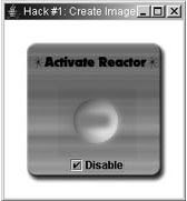
With the addition of this code to ImageTest's main() method, the imagebased showcase program is complete. shows what the running program looks like in the selected but disabled state.

Selected and disabled


Assalam mu'alaikum
ReplyDeletemas aq kemaren udah coba program yang mas buat tentang sms gateway_y itu, aq coba dwonload trs aq jalankan ko ga mau tampil program_y padahal library_y udah aq lengkapisemua tapi ko ga mau tampil sukses, mas tolong dunk kirim kan cara dan langkah - langkah menjalan kan program sms gateway itu ke E-mail Aq : putra_mandiri89@yahoo.co.id
Aq butuh banget nieh mas Buat Tugas TA Q....kirimin ya mas bantu aq...lok bisa secepat_Y ya mas.
Terima kasih
Aku coba jalan tuh!! paling belum disetting no port dan nilai baud nya, disesuaikan aja sama hpnya
ReplyDeleteTuh, kan.. Mas Rahmad HW juga hebat...
ReplyDeleteKak saya mau bikin aplikasi kamus seperti trans tool. Coba lihat postingan saya, kalo ada masukan dan ingin berkontribusi silahkan.
Toha.